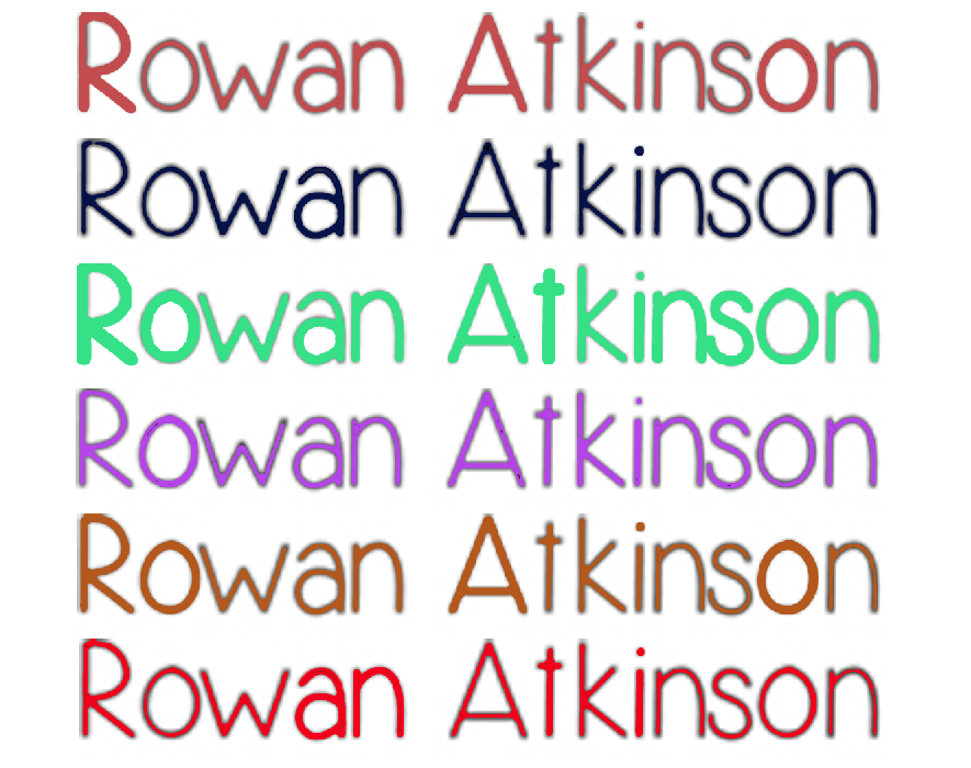
I produced a list of things Thomas should consider when choosing the font, thankfully Thomas has completed these task. One of the key tasks was choosing the colour of the font as we couldn't have black as we originally intended as it would be obscured by the black ground present in our title sequence. With this in mind Tom produced this image of he fonts in various colours, we then had a discussion today as to which one would be most appropriate and which one we liked the most.
Out of all the above our preferred font was red. The first reason was for the visual aspect, as red and black are very complimentary therefore the red would look appealing on the black background. We also like the fact that red connotes both love and danger, which are two key themes in our narrative. It is also important to emphasise danger in our title sequence as the genre of our film is action thus red is the most suitable colour for conveying that.
No comments:
Post a Comment