After looking back over our storyboard we realised we originally intended to add foley sound therefore we wanted to create some sounds which could feature in our title sequence to add realism and put emphasis on significant items such as the coin. This is a video of some sounds we tested for the sequence which will feature when the coins are being grabbed and when a coin is flipped.
Thursday, 20 December 2012
Next step: To do list

- Film the briefcase scene
- Film underwater scene
- Do foley sound
- Film water gun
- Film phone blowing up
- Find a suitable coin flipping video on youtube
Props needed:
- water gun
- briefcase
- coins
 - torch
- waterproof bag
- green screen
- Old mobile phone
Journal - 20/12/12 soundtrack and editing
Soundtrack


Today we decided to pick a suitable soundtrack which would work in sync with the visuals of our title sequence. In order to avoid using copyrighted material we used https://audionetwork.lgfl.org.uk to ensure there were no complications with the music.We already had a rough idea of what we wanted our music to consist of, such as change in pitch and an increase in tempo to create excitement. With this in mind we also needed it to be able to convey the narrative subliminally to the audience with needing the help of the visuals, to do this we needed to ensure the music was upbeat thus having a exultant tone so the audience are aware the story will end in restoration. We browsed through many different soundtracks on this website which fell under the category of 'spy' which we felt to be appropriate as we the thought this aspect of the story wasn't extremely clear through the visual representation so the music would secure the sub-genre.
1) Agent x
Agent x was disapproved by our group simply because it consisted of heavy bass which made it sound like a heavy metal piece of music which wasn't at all appropriate for our target audience. However, the music also had a slightly scientific tone to it which resembled music sound in a film of the sci-fi genre thus this would be a inaccurate choice of soundtrack for our title sequence. This also was to male dominated and gave no indications of the action adventure or comedy genre.
2) Alone in love
We was very fond of the fact this soundtrack had an romantic undertone because it allowed the theme of love to be present in the sequence however due to it being jazz music it gave the wrong impression of the time era as jazz is associated with the 60's. The low tone of the instruments also made the music appear depressing and slightly serious which is oppositional of what we intended.
3) city streets
This music replicated techno music found in nightclubs which gave an adult theme to the soundtrack therefore straight away it wasn't going to work with our title sequence. This music was also strangely relaxing, which was definitely not a positive due to our production being fast paced. One thing we did approve of was the fact it sounded modern which introduced the fact that our film is set in the present.
4) Follow that car
This was our chosen soundtrack which we couldn't be happier with it includes everything we hoped for and works perfectly in time with our pending title sequence. It sounds very comical and suitable for children, which is an instant bonus due to our target audience and one of our main genres being classified through the music alone. Also, the fact the music is very upbeat indicates the audience that the films outcome will be positive. A slight sense of romance is also present in this piece due to it sounding like a couples dance scene from a comedy which was brilliant as this is a key theme and element of the narrative. The tempo of the soundtrack is fast which reveals the film will be fast paced which is accurate due to it being an action film therefore this was enough to allow us to realise this music was the best choice.
Editing
 We were unable to film today due to the remainders of our scenes needing to be filmed at different location so we decided to start the editing process and edited the footage together that we already had. We opened all our videos in final cut pro and put them in the order of which we wanted them to appear, the same as we had story boarded. We mainly focused on the speed in which we wanted the clips to be as we wanted a camera flash and the falling of a photograph to be much slower in contrast to the rest of the sequence otherwise they would be to fast to see thus creating confusion for our target audience which we didn't want to happen or our genre could be questionable. Once we was satisfied with the footage we had edited we searched on dafont.com for a font for the order of the titles. I am happy with the font we have chosen as it looks similar to our title's font and still resembles handwriting I am also pleased with what we have achieved today because now that the editing has started it feels as if we are making progress with our sequence and coming closer to finishing. Our next step is to film our underwater scene at Danson park ,which we shoot be doing shortly, and we also need to film our brief case scene after which we will have all the footage and all that is left to do it edit.
1) Agent x
Agent x was disapproved by our group simply because it consisted of heavy bass which made it sound like a heavy metal piece of music which wasn't at all appropriate for our target audience. However, the music also had a slightly scientific tone to it which resembled music sound in a film of the sci-fi genre thus this would be a inaccurate choice of soundtrack for our title sequence. This also was to male dominated and gave no indications of the action adventure or comedy genre.
2) Alone in love
We was very fond of the fact this soundtrack had an romantic undertone because it allowed the theme of love to be present in the sequence however due to it being jazz music it gave the wrong impression of the time era as jazz is associated with the 60's. The low tone of the instruments also made the music appear depressing and slightly serious which is oppositional of what we intended.
3) city streets
This music replicated techno music found in nightclubs which gave an adult theme to the soundtrack therefore straight away it wasn't going to work with our title sequence. This music was also strangely relaxing, which was definitely not a positive due to our production being fast paced. One thing we did approve of was the fact it sounded modern which introduced the fact that our film is set in the present.
4) Follow that car
This was our chosen soundtrack which we couldn't be happier with it includes everything we hoped for and works perfectly in time with our pending title sequence. It sounds very comical and suitable for children, which is an instant bonus due to our target audience and one of our main genres being classified through the music alone. Also, the fact the music is very upbeat indicates the audience that the films outcome will be positive. A slight sense of romance is also present in this piece due to it sounding like a couples dance scene from a comedy which was brilliant as this is a key theme and element of the narrative. The tempo of the soundtrack is fast which reveals the film will be fast paced which is accurate due to it being an action film therefore this was enough to allow us to realise this music was the best choice.
Editing

Saturday, 15 December 2012
Journal: 14/12/12 Typography and titles
Typography
Common order of titles:
- Name of studio
- Name of production company
- Producer name
- Staring (starting with the main actors)
- Featuring (featured actors)
- Casting director
- Composer of music
- production designer
- Editor
- Director of photography
- producer
- writers
- director
Once we established the order in which the titles appear we knew where to insert the names into our title sequence, this was very useful due to our title sequence being able to look as realistic and detailed as possible. We made a list of where these titles would appear on our story board.
Looking at typography in existing productions.

Catch me if you can
- Titles are integrated into sequence (become part of the action)
- Influenced by Saul Bass (Lines,geometric shapes and use of bold colours)
- Exit screen smoothly looks elegant and could resemble the character who plays the police officer.
- Typography looks stylised and works in sync with Jazz music.
- High production value
- Font is sans serif

Se7en
- Two types of font
- One font represents a typewriter from an early period of time, this represents the killers character and where his mind remains.
- Distortion of font makes it seem out of the norm represents killers murders, genre of film and how it is difficult for other characters to understand the killers way of thinking. Also ties into an earlier period of time as it resembles old projectors.
- second font is thin and resembles the killers handwriting which represent the theme of identity. Font is slightly scratched into which works in sync with the removal of fingerprints.
- The font is drained of colour meaning it is dull and almost lifeless which indicates to the audience that death will be a strong aspect of the film which allows the genre of thriller to be identified instantly.
I personally love the typography used in the opening title sequence of se7en as it really conveys a sense of obscurity to the audience resulting in a tense atmosphere which makes the audience feel on edge as they have no idea of what they are about to see next. The font also works well on the black background which gives an impression of unleashing something which is normally not seen or doesn't exist in this case it is the killers mind is being unleashed.
 Lord of war
- Writing looks soviet and military styled.
- Straight and precise, could represent the precision of making a bullet or the shot at the end.

Forest gump
- Classic font portrays the film is timeless and suitable for all audiences.
- Coloured white connotes purity and innocence, could represent a character.
- very straight and no form of editing to distort the text shows the film is light hearted.
Common order of titles:
- Name of studio
- Name of production company
- Producer name
- Staring (starting with the main actors)
- Featuring (featured actors)
- Casting director
- Composer of music
- production designer
- Editor
- Director of photography
- producer
- writers
- director
Once we established the order in which the titles appear we knew where to insert the names into our title sequence, this was very useful due to our title sequence being able to look as realistic and detailed as possible. We made a list of where these titles would appear on our story board.
Looking at typography in existing productions.

Catch me if you can
- Titles are integrated into sequence (become part of the action)
- Influenced by Saul Bass (Lines,geometric shapes and use of bold colours)
- Exit screen smoothly looks elegant and could resemble the character who plays the police officer.
- Typography looks stylised and works in sync with Jazz music.
- High production value
- Font is sans serif
- 60's styled which hints time era of film/setting
- Informal font suggests film wont have a consistent serious tone and elements of humour could be present.
- Smaller words are serif which resembles an old typewriter which again references the 60's and suggests significance of the object in the film.
I found the titles for catch me if you can to be extremely intelligent to the time period and a significant object to be identified all through the style of the font. I wanted a similar outcome for my groups chosen typography so we took this into consideration and allowed the character profile of our protagonist, the genre and the target audience to be identified through the typography.

Se7en
- Two types of font
- One font represents a typewriter from an early period of time, this represents the killers character and where his mind remains.
- Distortion of font makes it seem out of the norm represents killers murders, genre of film and how it is difficult for other characters to understand the killers way of thinking. Also ties into an earlier period of time as it resembles old projectors.
- second font is thin and resembles the killers handwriting which represent the theme of identity. Font is slightly scratched into which works in sync with the removal of fingerprints.
- The font is drained of colour meaning it is dull and almost lifeless which indicates to the audience that death will be a strong aspect of the film which allows the genre of thriller to be identified instantly.
I personally love the typography used in the opening title sequence of se7en as it really conveys a sense of obscurity to the audience resulting in a tense atmosphere which makes the audience feel on edge as they have no idea of what they are about to see next. The font also works well on the black background which gives an impression of unleashing something which is normally not seen or doesn't exist in this case it is the killers mind is being unleashed.

- Writing looks soviet and military styled.
- Straight and precise, could represent the precision of making a bullet or the shot at the end.
Forest gump
- Classic font portrays the film is timeless and suitable for all audiences.
- Coloured white connotes purity and innocence, could represent a character.
- very straight and no form of editing to distort the text shows the film is light hearted.
Friday, 14 December 2012
Receiving feedback from public

This is a talley we took which conisted of the 4 fonts we needed to choose between. We asked members of the public who our film would appeal to and explained what our film was about and then asked which one they thought was most suitable. To conclude the fourth font was the most popular which we was satifisied with as this was the one we wanted to use.
journal - 10/12/12 First shoot
Today we started to film our title sequence. We found a location in school which resembled an office and was suitable for the opening of our title sequence due to it resembling a legitimate office. In order to achieve our desired goal of having the background completely blacked out to create a mysterious aspect to the character we inserted a green screen behind the desk for later editing.
in order to achieve a dolly, we placed the tripod on a dolly which allowed the cinematographer to smoothly glide into our close up shot thus making it more professional.
We also did some dummy shots of birds in the sky which was extreamly problematic as the birds were unpredictable which made them hard to capture on film.
I am very happy with the outcome of today as we managed to film all the shots we needed from the office location, next we will be filming the single shots of camera flashes and confetti. Our group will also be shooting at Danson park soon as we need to do some underwater shots in the lake to show the picture of Mr Teddy grandmother sinking. I am slightly worried about these shots as I am concerned that the water will be to murky and we wont be able to see the photo therefore we will be inserted some form of waterproof lighting into the water before hand in hope that this problem wont occur.
Location shots


Choosing a font and colour
We have chosen these fonts, however we need to narrow it down for one font for our title sequence. To do so we analysed the fonts to see which one actual had the most relevance to our film, after which we took a tally from the public to see which one they preferred. We needed to take the narrative and character traits into consideration when choosing the perfect font for our titles.
Font 1

-Our group felt like this font was to swirly and feminine and when we asked members of the public what they thought of the font they were under the impression that it was some form of signature which wasn't the style we intended. The font also failed to convey our comedy and action genre due to it's classic and elegant look which didn't appear suitable for the target audience of children.
Font 2
- This text appeared to be to childish and we felt it wouldn't appeal to our secondary audience of parents and older siblings. Members of the public thought it replicated the play dough logo which is designed for young children thus this font wasn't the font we wanted to choose due to our target audience being above the age of lego users.
Font 3

- This font was the complete opposite of what would be suitable for our genre the scratched effect of the font replicated typography found in a horror film. This font also didn't allow our narrative to come through as members of the public believed the film was a slasher thriller thus the font was completely unsuitable.
Font 4
- This was our favourite font out of all the ones above due to it resembling handwriting which we liked due to it conveying to the audience that it was written by the protagonist thus making him appear more significant due to his handwriting be the titles. The font also replicates our genre as it has a comedic and entertaining element to it because of the slight curl and it also reveals our target audience is children as it is a font they are familiar with as it's handwriting. Members of the public felt this typography was clean and precise but without being professional which made it look humorous After creating a tally chart to receive feedback from the public the number of votes received for this font where the greatest therefore this is the font we will be using for our titles.
Deciding on a font colour
When choosing the colour of the font we wanted to keep it simple yet meaningful, so we mainly focused on the appearance and the various connotations of colour.

Red: Red was one of our first choices of colour as it isn't specifically gender associated meaning it would appeal to a wide audience as we intended. However, this colour wasn't appropriate due to the negative connotations of danger and the association with blood. The colour red does however connote romance but as this is only an underling theme we didn't think it needed to be classified in the colour as the our spy narrative wasn't coming through strong enough.
Blue: Blue was our second colour choice as it is stereotypically more appealing to the male gender, our main target audience, therefore this would seem like the perfect colour. The connotations of blue is depression and loneliness which may be subliminally present in our film due to the death of Teddy's grandmother but we didn't want this coming across in the colour scheme as it isn't suitable for a young audience.
Black: We finally decided on black due to it looking sleek and modern and it would be expected as our titles are designed to replicate handwriting. Although the connotations of black are mainly negative, for example evil, there are still connotations which are both positive and relevant to our narrative. The fact black connotes secrecy ,which may been seen as a negative, it work well with the other aspects of the micro features in our title sequence. The intended soundtrack is a prime example of this as we are looking for something which is upbeat to rule of the negativity of the colour and will allow the secret identity associations to be identified instead of forcing negative engimas upon our audience. Also the footage we have so far prove to be comedic thus is it certain these assumptions of the colour will be over ruled.
Thursday, 6 December 2012
Storyboarding


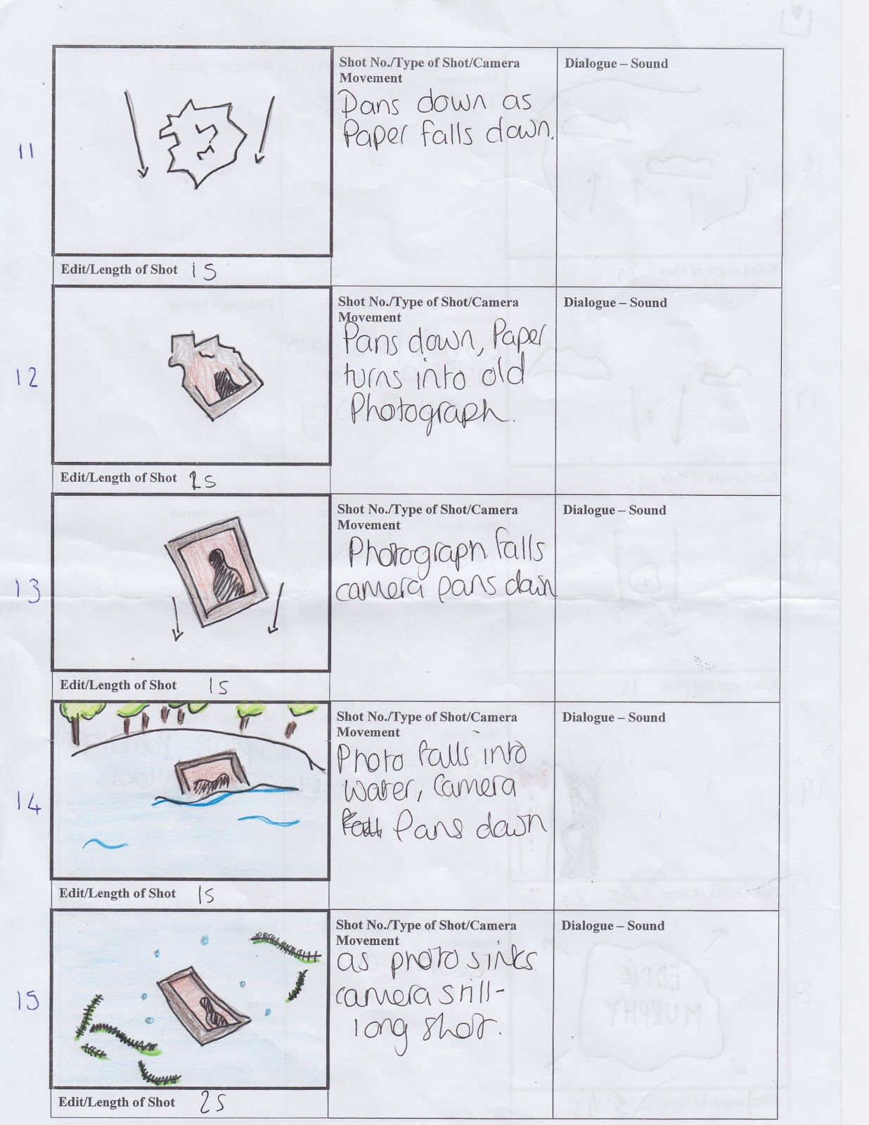


This is our idea story boarded we wanted our title sequence to look mysterious therefore we planned to not reveal our protagonists face to ensure his status as a spy is known to the audience. However, as our film is mainly targeted at young children we needed to still provided entertainment to keep them engaged, to ensure this was successful we added humor into our sequence such as the bird poo falling onto our actor which we hope will have a comedic effect on our audience.
we managed to combine all our ideas into one sophisticated and well planned idea which would work successful to convey the narrative and characters personalities to the audience whilst creating enigmas one being who is the protagonist.
Just like our brainstorm we wanted to include essential iconography to show the plot development genre and themes thus we included a brief case for example as it is a convention of the spy genre. We made sure to show our narrative in the title sequence however this is not yet obvious to the audience as we didn't make it completely identifiable.
After story boarding we then knew which locations we wanted to film at, thus the outcome of storyboarding was a better understanding of our title sequence and the development of it all.
Brainstorming

We focused on four major areas iconography, themes, genre and cinematography. We wanted to ensure these areas were covered so our narrative could be portrayed in the sequence as we wanted to go for a more image based title sequence which portrayed the underlining themes rather than a animated based title sequence for example.
From brainstorming we decided on representing the themes of love, family, death and stupidity. We were able to show this simply through the iconography itself the confetti and camera flash would portray the theme of love and family. The sinking photograph would portray the death of the nan thus death and the bird poo would represent the characters stupidity. We also showed minor elements of the narrative such as inheritance this was shown simply through the use of money which also foreshadows the bank robbery, a significant event which the story line hangs upon.
We needed to include object which would convey to the audience that the protagonist is a spy, to do this we wanted to insert stereotypical spy objects into our sequence such as a magnifying glass and a watch.
We wanted to show the storyline through the title sequence therefore we make sure to show everything that would occur subliminally in our sequence for example the coin turning into the ring which then falls into the suitcase convey that Teddy's marriage will be at stake due to his new identity and the coin simply represents him having bad luck due to his idiotic personality.
Assigned roles
In our groups we assigned a specific role for each person this included a director, a props and location manager, continuity manager and cinematographer. My selected role was the director and producer which meant that I would be the person checking in on the group to ensure everything is up to date and everyone is on task, it is also my job to make sure everything is running smoothly so the title sequence and the planning can provide the best results possible.
My specific areas of responsibilities.
- Checking up on the group
- making sure everything is up to date
- Making sure I am aware of everything happening
- Making sure all group members are where they are suppose to be at all times.
Other rolls
Props, location and make up manager - Louise
We assigned Louise to the role of props, location and make up manager due to her expertise in finding the right locations. She also has a strong awareness on the props we needs and is very reliable so we can guarantee we will have our props ready when we need them.
Cinematographer - Daisy
We assigned Daisy to the role of the cinematography due to her brilliant camera work and capability to follow the story board thus we know our ideas well also be visually presented as as we have planned. She also films very professionally and uses appropriate equipment to ensure the camera work is sophisticated.
continuity manager - Thomas
We assigned Thomas to the role of the continuity manager due to his expertise in the rules of filming such as the 180 degree rule. Thomas is very analytical thus he can identify mistakes with ease therefore we can rely on him to make sure our mistakes are erased.

Monday, 3 December 2012
Blog feedback video
After recieving my feedback I made some minor changes to my blog which has impacted on the presentation being more appealing. I added screen shots from the title sequences I was analysing to visually portray what I was analysing. I also added a new label, 'journel', which enables me to reccord my process of using what i've learnt in lessons to help with the creation of my group's title sequence.
Subscribe to:
Posts (Atom)