Thursday, 31 January 2013
Journal 30/01/13 - changing the fonts

These are some changes we made to our titles due to grammatical errors and the fact we had to adapt the number of titles which were going to be displayed to the length of our sequence. These changed have helped to ensure that everything is spelt and placed correctly.
Journal - 30/01/13 adding the fonts
Today I was overviewing Daisy and Tom who were adding fonts and transitions to the title sequence. We all meet really early in the morning in order to finalize our title sequence as well. Yesterday we managed to get all the clips uploaded and ordered. We also managed to complete most of the elliptical editing meaning all that needed to be done is the adding of titles and the remaining few clips to be added. Lastly, we will be adding the soundtrack, foley sound of scrunching paper and if there is time the production company logo. We managed to have all this successfully completed.
Below is the process we went through to add the fonts and the effects to the fonts.
Step 1: We added the text to our time line by using this drop down menu.

Step 2: We typed in what we wanted the text to read.

Below is what we wanted our text to say.

Step 3: We positioned the texts on screen where we wanted them to be placed/appear.

Step 4: to add a transition to effect how the text would exit we went into effects and the selected the one we wished to be added to our text. Daisy picked band slide which looks great as it ties into our theme of action and represents how Teddy rushes off to stop the bank robbery in the narrative.

Wednesday, 30 January 2013
Journal 29/01/13 - Problems which led to sequence change
This video explains all the problems we encountered which led us to change our sequence.
- files being corrupted
- title sequence not making sense
- missing footage
- constant outfits changes due to filming on different days
- awkward camera angles because of confined spaces
- files being corrupted
- title sequence not making sense
- missing footage
- constant outfits changes due to filming on different days
- awkward camera angles because of confined spaces
Tuesday, 29 January 2013
Journal 30/01/13 - foley sound
As our title sequence is mainly focused around Thomas scrunching up paper we felt it was necessary to add foley sound to emphasize the scrunching of the paper so the title sequence had more realism to it. I tested 3 different types of paper and we sha'll see how they work with our sequence and which one has the best sound to it before we decide on a final one.
Journal 29/01/13 - changing the sequence
Due to a series of complications, which I shall be explaining in more depth in a separate post, we had to change our title sequence. With time being an issue we had to take the simplistic approach to our sequence or we wouldn't have the sequence completed in time. We brainstormed a new idea which focused on elliptical editing as we wanted a simple sequence which still allowed the narrative to be portrayed. This gave a nice effect as it showed the two sides to Teddy, everyday Teddy and spy Teddy, therefore through the sequence his occupation is portrayed.
We had Tom writing a funeral speech for his nan, in which he kept messing up and throwing the paper towards to camera. This was to represent the repetition in training Teddy had to do to become a spy.

Whilst this is happening we placed scenes of action which we filmed, and a incorporated a couple of scenes from our original footage which we were lucky enough to have on a usb, in the background of the shot.

To create a sort of ghost image/ elliptical editing we uploaded the videos to final cut pro and dragged the video we wanted to be displayed on top over the clip it will be displayed on. We then went into the opaque settings and lowered the setting so the clip would turn transparent.

Once we had done this we noticed the videos didn't run smoothly together thus we added a cross fade at the ends of the clips so the sequence would come together professionally.

Journal - 28/01/13 feedback
 Today I received feedback on my blog which was overall positive therefore I will be keeping my current level of posting continuous. One negative I received was that my posts were a little wordy and I should consider mixing up the way in which I post. I have taken this into account and will be producing a video of one of my blog posts soon along with Louise and Daisy, as they received the same comment. I am delighted with my feedback and will continue to put a lot of effort into my blog.
Saturday, 26 January 2013
Over viewing the group - special effects
Daisy is currently looking at transitions to place on the titles. These transitions will convey our genre, a sense of the narrative, or a theme to the audience. The effects has now been chosen which visually represents a car speeding off the screen. We are all happy with this transition as it conveys action and the speed of the action scenes present in the film.
Thursday, 24 January 2013
Foley sound in the pink panther title sequence
Today I will be looking at the foley sound used in The Pink Panther and I will be identifying why it is there in order for me to understand why certain points have foley sound on them. I am hoping to interpret my findings and translate them into our own title sequence. Below are a few sound effects I analysed as these were the ones with the most importance.


Journal 24/01/13 - Foley sounds
Being the foley sound co-ordinator it has come to my attention that our sequence is in need of sounds in order to boost the excitement aspect of the sequence as it is lacking enthusiasm. Even though we have added a soundtrack to our sequence we still hope to add some foley sound in order to engage the audience and add more depth and realism to the sequence. Four main parts of the sequence I have specifically focused on for foley sound is the bird poo scene, the coin toss,the water gun and the coins dropping. The reason for this being that they are significant scenes which have a deeper meaning thus it is important they are emphasized as much as possible.
Bird poo scene: I intended to add a squelch sound which would mimic the splat of the bird poo as it contacts the shoulder of our protagonist. The reason I wanted to add sound on this clip is because it represents Teddy's life becoming dull and miserable once his Grandmother passes away (His life turns to poo.)
The coin toss: I wanted to add a high pitched ping noise to the coin as it flips to signify good luck and also show precision which will represent the plan to stop the bank robbery from happening in the narrative. For this sound I had to experiment as I couldn't get the sound right and I believe to do this we will have to layer the sounds to create one sound. As seen in my previous foley sound video I hit a glass with a metal knife which let off a high pitched noise, I also dropped a coin from a distance onto tiled flooring which let loose a ping sound. I think these will be the perfect sounds to join together to make the perfect coin toss.
The water gun scene: This sound was more tricky as I experimented with many different sounds to mimic the perfect water splashing sound but none turned out how I expected. Various methods I tried include tipping water on glass, splashing water in a sink and dropping water from a distance on concrete. Again, to make the perfect sound I think we will have to layer the sounds.
The coins dropping: This sound was the simplest as it just consisted of me dropping coins onto the pavement, however I did experiment with the quantity of coins to see which had the better sound. It was important to add sound to this clip as it conveys to the audience that Teddy is simple minded and not very intelligent, it also represents the theme inheritance. Also as we are unable to see the coins fall to the floor due to the number of frames per second the flip camera runs at it is important to have the sound so the audience are aware of what is falling from the suit case.
Props used:


Shooting and removing scenes - 24/01/13
 Today we decided to re-shoot the opening of our title sequence as we thought the camera movement was slightly wobbly which made it hard to change the green screen to another image thus we decided to completely re-shoot the scenes. This had a positive outcome as it looks better with a natural background instead of the artificial appearance of the fake green screen background. The camera movement is now smooth and precise which resulted in a sophisticated look to the whole scene which we are all pleased with. We also decided to remove as many green screen scenes as physically possible as they weren't looking realistic and made the sequence look childish.
This was the background we intended to add as it created a professional atmosphere due to Teddy being located in an office. However, as the background was motionless and the overlapping footage was moving the final result just looked disastrous which is why we needed to re-shoot.
Font - Decisions and difficulties
Font 1
Today we were dedicating our time to looking over the fonts as we noticed a flaw in our typography, this being the boldness of the writing, which caused the letters to merge together resulting in an unprofessional outcome with a sloppy appearance. As you can see from the image below the scale of the writing is fluctuating and the letters are starting to conjoin resulting in the reading difficulty to increase.

Because of this flaw we opted for the original design which was thin and gives a smart appearance, representing the proffesionism of a spy. However, we decided that red wasn't the right colour for our title sequence because looking at it again it replicates a beano comic which creates false assumptions about the films contents. We wanted to keep the font simple and go back to a white font as this is more appropriate for our film and we don't have to deal with the mixed connotations of the red which could create confusion for our audience.
Font 2

This is the white font, which looks really appealing and easy on the eyes. As white is a bright colour we are hoping that it will be able to show up on the darker background of our sequence however, we can't make this our final font for definite as we have removed the green screen scenes meaning there is a decrease in black backgrounds therefore the font might not be clear enough. I like the white font because I think it resembles the white shirt under a black tuxedo which ties into the narrative as Teddy becomes a successful spy.This also fits into the theme of secret identity as a black tuxedo is key iconography for any spy or action film. White also connotes innocence which represents the character of Teddy as he is becoming a spy to do good in the world.

Wednesday, 23 January 2013
To do: 23/01/13
Now that all the filming is complete and up to scratch all that is left to do is the editing. As a group we have finalized the font and the colour which we are all very pleased with. This is a mock up of the font created by Thomas which is looking great. I think the font is very sophisticated and very well planned as every aspect of the font has some form of relation to our title sequence. Since improving the font it now looks bold, which represents our protagonist as being heroic and recognized as a hero. This also adds a cartoon effect to our title sequence which makes it appear more suitable for children. This cartoon effect ties into our narrative as Teddy almost becomes like a superhero from a comic. A positive about the font being bold is that is it eye-catching and promotes and introduces the stars of our movie to the audience if they wasn't already aware, and the boldness ensures that the stars named aren't easily missed.

Thursday: Today we hope to continue editing our sequence as we have all the clips and we are currently in the process to arranging and perfecting the clips in final cut pro. If this is completed early we hope to get all the green screen videos done and look precise and clean, after which they can then be added with the rest of the clips in final cut pro.
Friday: Today will be a matter of adding in our titles and adding effects and transitions to our title sequence thus it is up to our special effects manager to find a suitable transition for the font and figure out how it will enter and exit the screen which should be done very simply due to me and Tom having conducted research in this specific area. If this is all completed to plan then our sequence shall be complete by today.
classifying the font colour
Although we all thought red was the best choice for our title we wanted to ensure it was most appealing for our target audience considering they are our main priority. We surveyed 50 people in total which meant our research was more accurate due to the larger number of feedback. Luckily for our group red was the declared the most popular by the public thus our final choice of colour will indeed be red.


It can be seen from these results that red won by a landslide thus it is certain it is the preferred colour. I am very happy with these results as I think if red wasn't appealing to our target audience we would have a hard time fitting any other colour into our title sequence as none of the others had the right connotations or significance as the red.
Tuesday, 22 January 2013
Over viewing the group - Choosing a font colour
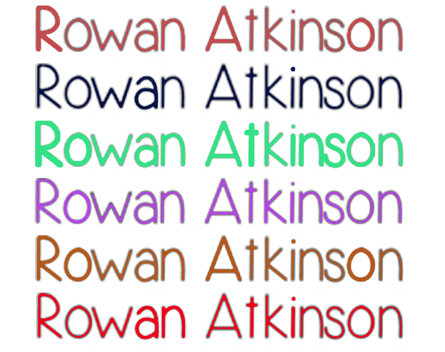
I produced a list of things Thomas should consider when choosing the font, thankfully Thomas has completed these task. One of the key tasks was choosing the colour of the font as we couldn't have black as we originally intended as it would be obscured by the black ground present in our title sequence. With this in mind Tom produced this image of he fonts in various colours, we then had a discussion today as to which one would be most appropriate and which one we liked the most.

Out of all the above our preferred font was red. The first reason was for the visual aspect, as red and black are very complimentary therefore the red would look appealing on the black background. We also like the fact that red connotes both love and danger, which are two key themes in our narrative. It is also important to emphasise danger in our title sequence as the genre of our film is action thus red is the most suitable colour for conveying that.
Out of all the above our preferred font was red. The first reason was for the visual aspect, as red and black are very complimentary therefore the red would look appealing on the black background. We also like the fact that red connotes both love and danger, which are two key themes in our narrative. It is also important to emphasise danger in our title sequence as the genre of our film is action thus red is the most suitable colour for conveying that.
Journal 22/01/13 - Re-shooting scenes

Scene re- filmed
Shot 26- 35

Thursday, 17 January 2013
Over viewing the group - Editing
This week louise has been editing our sequence which has consisted of eliminating the green screen and replacing it with our desired background. Recently she has print screened the background from our bird poo scene to ensure the backgrounds are an identical match for the rest of our sequence. Our scene with the ring falling into the suitcase now has a brick wall background. I am very happy with this clip as it look professional and blends in nicely without a fake green glow. The only problem we have encountered is certain colours becoming distorted but this will be cleaned up in the upcoming week.
 Coin toss
This clip is of Tom flipping the coin, we intend to slow this clip down so the movement of the coin will be visible. Louise has now placed a plain black background onto the clip. This clip still needs the edges to be more blended but once this is done the clips will be ready to use. This clip is to represent Teddy having bad luck.
 Paper throw
This is our paper throw scene which consisted of a scrunched up piece of paper being thrown directly onto the camera lense making it appear as if it is coming towards the audience. I am very happy this clip as the paper blends perfectly into the black and the contrast between the colours gives it a slight 3D effect.
 Confetti
This is our confetti scene, in which paper being throw into the air was recorded to mimic confetti. Again, the contrast between the colours gives it a 3D effect due to the foreground, the paper, standing out more. This clip is used to represent Teddy being married.
 The wall
This is the image we will be using as the background for the last scenes of our sequence. In order to get this image Louise print screened from the footage of our protagonist getting covered in bird poo.
 Final result
This is the final result. This is the suitcase video with the background image of the wall. I think this looks very sophisticated and the ring looks extremely distinct against the wall which we are blissful about as this was a concern we had.

This clip is of Tom flipping the coin, we intend to slow this clip down so the movement of the coin will be visible. Louise has now placed a plain black background onto the clip. This clip still needs the edges to be more blended but once this is done the clips will be ready to use. This clip is to represent Teddy having bad luck.

This is our paper throw scene which consisted of a scrunched up piece of paper being thrown directly onto the camera lense making it appear as if it is coming towards the audience. I am very happy this clip as the paper blends perfectly into the black and the contrast between the colours gives it a slight 3D effect.

This is our confetti scene, in which paper being throw into the air was recorded to mimic confetti. Again, the contrast between the colours gives it a 3D effect due to the foreground, the paper, standing out more. This clip is used to represent Teddy being married.

This is the image we will be using as the background for the last scenes of our sequence. In order to get this image Louise print screened from the footage of our protagonist getting covered in bird poo.

This is the final result. This is the suitcase video with the background image of the wall. I think this looks very sophisticated and the ring looks extremely distinct against the wall which we are blissful about as this was a concern we had.
Wednesday, 16 January 2013
Over viewing the group - fonts for the crews roles
Below are four fonts that Tom has chosen to feature the roles of our crew members. Tom's next step will be choosing a suitable colour for our font and experimenting with the size of our font.


Our chosen font: Yummy Cupcakes

Yummy Cupcakes: Although I am not fully satisfied with this font it is still my favorite one out of all the ones chosen. I am really happy with the fact the letters don't connect as I feel this makes it easier on the eyes and allows the comedic genre to shine through due to this looking rather immature like Teddy. My favourite thing about this font is how compatible it looks with our other chosen font. I feel they work together to convey the narrative and transformation of Teddy throughout the story as the first is scruffy, representing him being inexperienced ,and the second is straight and precise, representing him once he succeeds his mission.

(as seen in this mock up created by Tom they compliment each other perfectly.)
This text also seems that it would appeal to a male audience due to it not being curly or too feminine which is a bonus as this is our target audience. This also successfully conveys the theme of identity to our audience as it looks like the perfect handwriting for our protagonist. The one aspect I am not satisfied with is the fact it looks extremely similar to our main title font which I fear will withdraw attention from the title and claim some of its significance. Hopefully this wont be a problem once it has decreased in size and has a transition added to it.

The great escape: This font looks to professional and since it is being positioned above a font which already has a professional appearance it wont have the same connection to the narrative or the transformation of the protagonist. By using this font it isn't indicated to the audience that our protagonist is an accident prone spy which would mean we have failed to meet our intentions for the font.

King cool kc: This font looks overly stretched and when the size is decreased for our titles I think it would appear out of place due to it looking like we have squashed the font. I think this font is also to bold which gives it the appearance of marker pen writing which would seem more suited for social realism film for example. I also think this font adds nothing to our title sequence as I cant see a connection between the font and our narrative,genre or themes.

Passing notes: I think this font is rather decent but I think the main attraction is the letter 't' due to it mirroring a crucifix, which obviously isn't appropriate for our titles as religion isn't a theme in our film. Again, I feel this font is to bold and would withdraw attention from our titles which is clearly a negative. I personally really like the different scales of the letters as I feel it adds a more personal touch to the font and represents Teddy's clumsy personality very well due to it being uneven. This fluctuating scale also conveys the feelings of unease Teddy will be feeling throughout the film due to the loss of his grandmother and the fear of loosing his wife.
Over viewing the group - Fonts for crew and cast
Recently Thomas has carefully picked out some fonts to display our opening titles in, below are the following choices. These first four are choices for the cast and crew members names to appear in.


 Little miss priss: Out of all the fonts this was my least favorite, therefore I can only flood it with negatives. Firstly, the font is curly and modern which immediately looks feminine meaning it wouldn't attract our target audience of males. As it looks modern it replicates the font which would be found on a chick flick film which consisted of girls with expensive and modern houses, which is the complete opposite of our genre. This also doesn't look like handwriting which would be produced by a male character which completely destroys our whole idea for the titles.
Chosen font: Simplicity

Simplicity: Out of all the fonts this is probably my preferred one as I like the spacing between the letters as it is easy to read for a young audience. I also like how straight and defined the letters are and I think it signifies the stability of a spy which although isn't accurate when it comes to our protagonist, as he is idiotic, but by the end of the film he is suppose to be a stable spy thus I think this works well to foreshadow the later narrative. I like the childish look of the font yet I still like how it mature to an extent as this conveys to the audience that it is the handwriting of an adult. However although I can praise this font a lot I am rather concerned with the letter 'd' as it is really rounded and looks rather feminine.

Throw my hands up in the air: This font looks very masculine and reminds me of an autograph which ties into the narrative of our film very well due to Teddy becoming a hero by the end of the film. The lettering is very rushed and has a scruffy finish which I think conveys the theme of secrecy as Teddy is trying to keep his identity unknown to his wife thus all spy related paper work must be completed quickly to ensure it wont be seen. The markings look like they have been done with a fountain pen which works in sync with our theme of business due to it connoting office workers. What I don't like about this font is the fact it looks slightly like graffiti which could give the wrong impression of our film and also I fear it would be rather difficult for a young child to read.

Mossy: This font I feel was to basic and spacious due to the simplicity of the stick-like lines. I'm not fond of this font as it looks like it has been produced by a child learning to write which although could relate to our theme of education, as Teddy must learn to be a spy, it still looks to unprofessional. On the plus side it is very spacious and would make our title stand out as it is rather thin.

New roles for the group
Director and sound - Me
I have the role of director as from the start this was my given role thus that has remained throughout the whole of the project. It is my duty to over look the group and ensure everyone is on task and has something to be getting on with. I will be posting what the group has been doing to ensure I am aware of what is going on at all times and I can guide them in the right direction and give them feedback on areas to improve on and things to consider. I have also taken the role of sound co-ordinator as I already recorded sounds for our title sequence and know where sounds she be inserted to create an effect on the audience.
Special effects- Daisy Moore
Daisy is in charge of special effects meaning she will be adding transitions to our work to make it replicate a legitimate title sequence. Daisy was given this role due to her outstanding creativity and her ability to experiment. Daisy is also fully aware of the themes, narrative and genre of our production thus she will be able to convert this knowledge into the effects resulting in an outcome which will add meaning to the transitions.

Editing - Louise Taylor
Louise will be doing the editing for the sequence however, once everyone has finished what they are suppose to be doing we will we be helping Louise as it has the largest quantity of work. Louise is very technical and has a brilliant understanding of adobe after effects. She knows what the title should look like visually therefore she has the creativity to turn it into visuals. As she was also the locations manager she knows which places/images need to be inserted on the green screen therefore we are guaranteed a fully accurate result.
Titles - Thomas Madden
Tom has the role of titles as he has an interest in titles and how they signify key elements of a film. Tom is also aware of all aspects of the film thus he knows what is suitable for our film. Tom is also good at identifying genre and themes through the titles alone therefore he will be able to use this knowledge and convert it into our own sequence.
Subscribe to:
Posts (Atom)